
Another day, another challenge!
Well word spreads fast in the land of Ciboodle, as I’d discussed in our previous team challenge “Escape! Games+testing = fun” one of the dev team leads had posted a challenge to our team. Now I’m not going to talk about challenges every day but this one has an interesting twist.
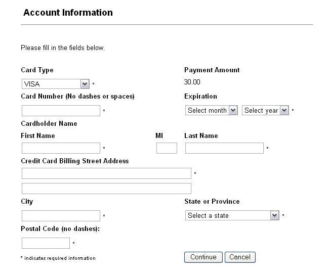
So the challenge was simple, something had annoyed him & he sent us an email titled “I know you like this game”. Which included nothing more than the following line & picture:
“What’s inherently wrong with this form?”
Easy, huh? Sadly only myself & my boss Michael took the bait and did the challenge, hopefully next time the rest of the team will be up for it.
The findings
Here’s a summary of what we noted:
Initial thoughts:
- We both noted we didn’t have much to test having been only provided with a screenshot.
- What were the requirements? Intended users? Business type? So many more questions we could have asked but only a screenshot to test.
Potential Defects:
- Both of us found roughly the same amount of things wrong, he noted a couple of things that I didn’t & vice versa.
- Globalization was considered “State, postcode, province” doesn’t add up right?
- Likewise the option menu said “Select a state”. Quite naughty.
- It was also recommended the postal code be dynamically updated to be specific for the country e.g. USA would switch it to a zip code.
- Like wise the same would apply for currency with conversions being done for that locale.
- It was noted that postal code was mandatory, yet not everyone in the world has a post code
- A couple of grammar issues got noted
- Expiration should probably say expire date
- MI means middle initials. Not everyone would realize this so why not just label it “middle initials”?
- The label “Credit card billing street address” doesn’t make sense if your using a debit card, why not just say “Billing Address”?
- We both noted address might require more than two fields
Observations:
- This appears to be a multi step process, but shows no indication of how many steps exist.
- The options for security code, issue number & start date are missing. While all these depended on the card type at least one should be required for any card.
Questions:
- A few questions around usability were asked:
- We assume the majority of people read from left to right, top to bottom. Would it not be better to place information regarding the asterisk in the description text at the top as opposed to the bottom?
- What makes smoother reading? Labels to the left of fields? Or above fields?
- Would it be more usable to have the negative action “cancel” to the bottom left & the positive action “Confirm” to the bottom right of the form?
Recommendations:
- A default value of “Please select” was suggested for option menus
- The layout was poor, we both suggested this be improved & gave some suggestions on how to do this.
- The card number & postal code both gave instructions on what not to enter, why not just code it to strip these out?
- It was suggest that something to show the site was trustworthy be added
- The title stated “Account Information” but was taking a payment. It was suggested that the title name be changed to something more appropriate.
- Rather have a different label & field for each part of the customers name, why not ask them to enter their name as it appears on the card.
- It was also suggested that auto lookup of an address from entering the postcode be added.
The “aha!” moment
Simple yup, that was an easy one ![]() . Then it dawned on me, we’d misread the challenge! The challenge wasn’t to jump straight in and start reporting issues, it was to find something inherently wrong right?
. Then it dawned on me, we’d misread the challenge! The challenge wasn’t to jump straight in and start reporting issues, it was to find something inherently wrong right?
As testers we have a tendency to dive in & sometimes miss the obvious, the obvious here being the intent of the challenge. A good lesson learned & something I’ll think more clearly about in the future.
Mission Impossible?
So what was inherently wrong? We’ll I’d later found out the issue was to do with the “State or Province” option menu’s contents. It had no option for other countries so if you didn’t reside in the USA you were out of luck & couldn’t complete the form.
How do we know the content of the menu though? Good question! This lead me to dub this “The impossible challenge!” However was it impossible? Well when testing this I’d considered the fact that the postcode didn’t tie in with the state or province option menu. If you had a state you’d use a zip code right? Also the fact the menu’s default value was “select a state” made me curious if any countries would be available or not. However I’d made an assumption that the option “other” would be available in the menu as I’d saw this used often on many sites that I’d registered for in the past. I didn’t note any of this though as I’d already passed judgment in my head and assumed that “other” would be there. If I’d noted this it could have lead to further discussions whenever my results got looked at, discussions which could have led to this issue being fixed.
James Bach talks a lot about the importance of documenting our thoughts while testing, I think this is essential, this example highlights that. If you haven’t already heard James’s Coding QA podcast with Matthew Osborn & Federico Armas I’d highly recommend it, he talks a lot here about the importance of documenting your thoughts and provides suggestions on how to do this.
Lessons Learned
So I learned two valuable lessons from a simple challenge. Firstly after taking the challenge I’d realized I missed the point. The challenge was only to spot the inherently wrong issue or issues. Instead I gave a report of everything I felt was wrong with the form. Secondly I’d realized that it’s important to document your assumptions, even if you think they’re correct. This may prove to be valuable later as was proven in this challenge.
Taking it global
So is that it? Well not quite. I was curious, what if I took this challenge global using the same original email that was sent to me. Would others fall into the same traps? So I did, global it went & thank you to the following people for accepting this challenge: Albert Gareev, James Bach, Jeroen Rosink, Markus Gärtner, Rob Lambert, Simon Morley & Stephen Hill.
So you’ll be curious to find out their results no doubt, so here they are:
Summary:
- Only two of the seven people who participated avoided the trap of doing more testing than was asked for, these two only highlighted what they thought was inherently wrong, well done

- One person asked for more information, then provided me with a heuristic James Bach had created that I could use to test this (This wasn’t James if that’s what your thinking). I’m going to try this in work one day . “Can you test this Darren?” Aha! “Take this heuristic and test it yourself.”
- Most people reported the time they’d spent testing, this ranged from three to thirty minutes.
- From what I would consider was inherently wrong:
- Five of the seven highlighted the currency issue.
- One person stated that for all they knew the currency could have been in “Icelandic volcano fragments” . Who’s to say it wasn’t?
- One person stated that for all they knew the currency could have been in “Icelandic volcano fragments”
- Country didn’t appear to be an available option (this being the original issue the challenger spotted), one person spotted this.
- No security code which is mandatory for certain card types, two people spotted this.
- No start date which is mandatory for certain card types, one person spotted this.
- No issue number which is mandatory for certain card types, no one spotted this.
- You could argue that this is often combined into the security code text field with screen text explaining this.
- Five of the seven highlighted the currency issue.
- Other issues neither myself or Michael had noticed were:
- The dot symbol in the currency is interpreted differently in different countries.
- There was no clear form button, this could be useful.
- The expiration month appeared to not be mandatory.
- Some questions were asked assuming that the form was a wizard.
- A couple of people noted that you don’t always have to provide the billing address information for online payment forms.
- The use of a CAPTCHA was suggested.
- If your already logged in it was suggested your name be presented on the form.
- It was suggested that a help button be added.
- It was suggested that a privacy policy link be added.
- Someone suggested that the system inform you of the date that the payment will be taken on.
- Someone asked how the system would handle accounts belonging to multiple users?
- Someone asked how the system handles accounts for businesses? Would they require different fields?
A worthwhile experiment
What I’d gathered from this was that most testers are susceptible to traps as we’d often let our excitement get the better of us. I also learned that we have something to learn from everyone as they all had something new to add which I hadn’t thought about. So if we were to test something so vague in the future perhaps it would be a good idea to group test like this.
Simon Morley talked about “System Play” in a comment to my post on Proactive Testing, if we could do this using a group of testers, a white board, pen & some requirements or idea of what we’re testing, we could easily come up with a good basis for testing, and drill out any flaws that we spot early.
So once again another excellent learning experience. I doubt very much the person who sent this would have thought we’d have learned so much, but there you go. There are lessons to be learned in everything. Thanks for reading.
Related posts:
Good write-up!
One trick/tip when examining requirements (or questions on challenges or problem definition) is from Jerry Weinberg’s “Are your lights on?” – to remove or replace words in the requirement/challenge/problem-definition (using a dictionary or thesaurus) and see how the meaning changes – and work out if it’s important.
Good challenge and interesting “aha”!
Hi Darren,
Thanks for the challenge.
My answer was:
“I’ll give you a quick answer rather than a deep answer.
- I don’t see a country here. And yet it says “state or province” and “postal code” instead of ZIP code.
- The currency is not identified.
- There is no field for card security code.”
If it wasn’t otherwise clear, I was answering the question “what is inherently wrong?” I interpreted “inherently wrong” as “wrong in such a way as to defeat the apparent purpose of the form.”
When I give a quick answer I do not attempt to deconstruct the mission, etc., but that’s fair to do for people giving a deep answer.
– James
Darren,
Thanks for the challenge. In my daily work I encounter all kinds of buggy address collection forms and/or processes. This apparently simple task is really error prone. If people are interested I can set up a challenge to see what people make of it: especially since we have people from all over the world in the community!
I was interested in the number of bugs people found just by looking at a screen-shot. Thanks for feeding all that back Darren.
Stephen
Hi Darren,
Nice summary. It was a good challenge and I enjoyed working on it, albeit briefly.
Interesting to see some of the other suggestions and what people thought.
Nice one
Rob..
Simon
Good tip I’ve still to read that book. I’m currently a few chapters into his “Perfect Software: And Other Illusions about Testing”. It’s very interesting so far.
James
Thanks for sharing your response to the challenge; I thought it was an excellent response.
Stephen
I wasn’t sure about putting the issues we all found in to this post, as that wasn’t the point of the post, however I thought the readers might learn something from what others had found.
I’d be really keen in joining in on your challenge, please do set one up
Rob
Thanks Rob, glad you enjoyed it, what was really interesting about yours was because both our companies develop software for call centers our style of testing was very similar
Hi Darren,
Nice challenge and a great debrief, once again!
In my reply, I labelled my findings as “questions”, not “bugs”, for a reason: a static observation of a picture, which is not even a solid GUI form, does not give a good enough proof to advocate findings as bugs. In dynamic testing, most of the questions can be figured out by interaction and observation, and communicated within a team. But here, the best we can do is to mark all findings, whatever seems to be wrong.
Thanks,
Albert
Hi Albert,
Thanks for being up for the challenge, I agree with you, likewise I’d labelled anything I’d classed as a bug a “Potential Defect” along with “Thoughts, Questions & Recommendations”. We don’t know like you said at this stage we can only work with what we are given, and report our findings in such a manner that it allows the decision makers to easily make those decisions.
Cheers,
Darren.
Hi,
That is an exceptional write up. Thanks for sharing the link and great work on the challenge. I hope I can use the same to challenge my colleagues – with your permission
Hi Nandagopal,
Thanks for the kind words, I’m glad you enjoyed reading it
I’d be very happy for your team to try this, please let me know how they get on, perhaps you’ll blog about it as well?
Cheers,
Darren.
Darren,
Can I use/circulate the screen shot with my team mates/my tester friends for a challenge.
And can I blog those experiences?
Thanks,
Sudhamshu
I’d be very happy for you to, please be sure to let me know how you get on
Hi Darren,
Nice exercise and another great example that demonstrates that you don’t need to “finish” development to start testing.
I would argue that as long as you have addressed the primary mission and you respect the timebox then the additional information you provided would be valuable to the team/sponsor/stakeholders etc. Only the very narrow minded would respond with “You weren’t supposed to be testing that!”.
Cheers
Mike
Hi Mike,
Thanks for taking the time out to read this post & comment.
I’m with you on not having to restrict your testing to the mission. Like everything in testing if we have the time & we think it would be beneficial to the project then why not just go ahead and do it. My problem here was I didn’t realize the primary mission till after I’d done it.
Cheers,
Darren.