Summary
In the first post in this three part series on Entaggle I discussed some UX (User Experience) and usability issues with its two main focal points: The landing screen and public user profiles.
This post will focus on UX and usability issues again, this time though we will look at process flows and common actions that the user may take throughout the application and highlight flaws in those. We will also look at techniques we can use to reduce the cost of enhancing the user’s experience.
The final post in this series will look at the business model behind Entaggle, providing suggestions for improvement. I’ll finish this post with my conclusions on Entaggle.
Major Changes
So since the last post Elisabeth Hendrickson has been hard at work, making some major changes to Entaggle.

View of the new changed Entaggle home page.
Ignoring the right hand pane for now you’ll immediately notice a new tabbed navigation mechanism. Fantastic! We now have a common paradigm to navigate the site. This was one of the main issues we highlighted last time around, so it’s good to see Elisabeth was already working on that.
Identifying UX and usability flaws
So let’s move onto the flaws with common actions and flows the user might want to take throughout the application.
In order to keep this post focused to what is important we will list the three most common actions that a user might want to take. These being:
- Tagging another user.
- Viewing existing tags or users.
- Creating a tag.
Tagging another user
The process of tagging another user in Entaggle is fairly straight forward. The quickest way is using the “Tag Someone” tab which invokes a three step wizard.
- Select a user you want to tag.
- Select a tag you wish to give them.
- Confirm the tagging, which also includes the option to add a comment.
Another method to do this is when you are viewing a user’s profile, a list of tags you can assign to that user will appear in the right hand pane next to there profile. You can tag them directly from this page by simply searching for, or clicking on a tag. This is a little faster if you are already viewing someone’s profile, as you skip the user lookup step, it also lets you give them multiple tags quickly.
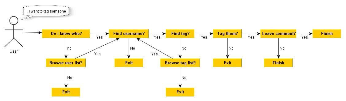
Process flow of tagging someone in Entaggle
It’s all very simple, and has some nice usable features such as the suggestions appearing as you type in a username to search for, or a tag that you want to tag someone with.
Bulk tagging
What happens though if I want to assign multiple tags to a single user? Or even a single tag to multiple users. Or better still multiple tags to multiple users! Well I can’t can I? Or actually I could!
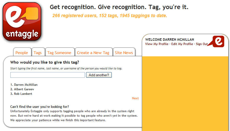
Tagging wizard step one, with new add another button.
By simply adding the option to add more than one user into the first step of the wizard, you instantly increase its usability. Now you no longer have repeat the wizard to tag someone else with the same tag. Of course there are many ways to do this, having the add another button is only one suggestion and you’d also have to account for a way to remove users, such as a X icon next to their name.
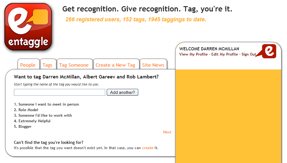
Tagging wizard step two, with new “Add another” button.
Like wise the add another button would work for step two of the wizard, when we choose our tags.
The final step which lets you confirm the tagging presents a problem as you’d not be able to add unique comments in its current implementation for bulk user taggings. You could however get around this with a couple of option menu’s which would allow you to still add unique comments for individuals, or a generic comment for all.
External users
There is another problem here. What if I couldn’t find a user in the system but wanted to tag them anyway? It’s a valid scenario and one which would enhance not only the user experience but also the products business model.

Suggestion for tagging an external user.
You can see an example above how this could look. I’m sure there is a better way, as my mock up here looks pretty ugly to say they least, but the general idea is still very valid. Upon completing a tagging of a user not in the system, that person would be emailed an invitation, which would include in the body of the email any tags that they’d been given, and the reasons for these taggings (if any).
Viewing existing tags or users
The people and tags tabs allow you to view a list of all tags or people. The users view has a search option, the tags strangely doesn’t (let’s add it). Both present a paged view of users or tags, each displaying twenty per page. Each allows you to drill in to view either more info about that user or tag.
Providing context relevant information
The major problem with this paradigm is that it’s a view of everything; in essence an information overload! One of the main problems I’ve had with Entaggle in the past was being able to find people that I know, quickly. Sure I can manually search for every person I might know, but some more clever stuff could occur to make that information more readably available to me.
As we have the ability to list a Twitter profile on our Entaggle profiles we could make good use of the twitter API and find people that we currently follow and highlight them in some way on Entaggle. I’d previously talked about a watch list in part one for filtering news events to be more specific to your needs. Using the matching results of our Twitter followers and Entaggle users we could have a suggestion list of users for our watch list. The watch list in essence would become your Entaggle version of Twitters followed users, or Linkedin connections. If we don’t like the idea of a watch list, we could just have a tab in the users list which is titled “People you may know.”
By allowing some sort of community interaction in terms of context relevant and watched users, people will immediately relate more with the application and want to come back to watch the people they follow. Dropping in the customised events news on the home page based upon your watched list (as we discussed in part one), the user will now easily see when a watched user has been tagged or has tagged someone else, as opposed to the entire community wide Entaggle users news view.
Categorisation
Now at least we have one mechanism of bringing more relevant users to our attention and this is a really important factor because as Entaggle scales to one thousand, ten thousand or even one hundred thousand users, this user list will become less and less useful to the user. Currently it’s already difficult to be aware of who to tag with just over two hundred users.
Another suggestion to bring more context relevant information to the user, would be to categorize users. If you expand the users profile that little more to indicate what type of industry they are in (there is lots you could do here this is only one suggestion) you could then follow up on the “people you may know” idea that we discussed for the Twitter API idea, from linking a users industry type with other users in that industry.
Likewise the same issue applies to tags, as they scale it will become more and more difficult to find relevant tags for your industry type. Even now with mostly developers and testers using Entaggle you still get very obscure tags such as “Manual Manic” (someone who executes tests manually). How would you know what this tag meant from glancing at it’s title? How would you ever know that if you weren’t a tester, or even in IT for that matter? You could be a doctor even! If the hope is that Entaggle will be adopted by all career paths over time, then this is something which needs sorted now.
This really does highlight the need for categorisation of tags. Just now we are seeing a mix of personal, career and fun tags. At least when the larger internet community comes around to adopting Entaggle, with tag categorisation I’d still be able to find tags of interest to me easily.
How you display tags by default is another thing. If a user profile that you’re viewing is a “Lawyer” then perhaps it would be wise to display by default only tags which are categorised as belonging to his field. You could still present a checkbox to display all tags if you like, and it would probably be sensible to do so.
You can be less clever about these things and simply go with a filter criteria to sift through data, just like what is used on sites such as Linkedin and Ebay.
By making things more context sensitive you greatly enhance the user’s experience. When we consider a greatly increased user base, it’s essential to provide some level of context sensitive data, otherwise the product becomes unusable and runs the risk of a rejected system. After all people will always look for a reason not to use your software.
Creating a new tag
The process of creating a new tag is extremely simplistic. You simply assign the tag a title, a description, some requirements (what would be required to get this tag) and the type of tag it is (private, public or self taggable).
Having previously spoke about the need to categorise tags, when you create a new tag you’d want to be able to select a category or categories that it would belong to.
Another quick win here would be to add a button called “Add another” next to the confirm button. Why? Well if I want to add more than one tag I’ll hit confirm, then be navigated away from this screen and be required to select the “Create a new tag” tab to return again. The add another would simply save the tag you created and blank the form inputs allowing you to add a second tag without having to navigating away from the screen.
Other than that I think this screen works well.
Cheap techniques to analyse user experience and usability
I’m conscious that I’ve talked a little too much already so I’ll keep this section very short!
Wireframe usability evaluations
If you haven’t heard of a wireframe before, don’t worry. They are simply quick mock-ups of a UI screen. In fact there is a fantastic tool on the market just now called Balsamiq which allows you to rapidly mock up high quality wireframes. If you don’t like the idea of spending a lot of time trying to draw wireframes then I’d highly recommend having a look as Balsamiq.
The idea I had around wireframe usability evaluations was simply as follows:
- Generate a wireframe for each screen in the proposed feature before you write any code.
- For each wireframe take note of any navigation elements on it such as buttons that take you to another page.
- Add this wireframe onto a html web page. For each navigation element add links appearing below the wireframe as hyperlinks to another wireframe that the navigation link would have went to.
From having a wireframe for each screen of the proposed features and having links to navigate you between each for any of the navigation links on that wireframe, you have essentially built a working model of the proposed feature. You can now begin to test the flows and highlight any issues found, make changes and retest to evaluate those changes, all at very little cost.
If you want to make better use of it, devise a list of end goals you want a user to achieve with the feature (e.g. create a new insurance report) and get some users who have no knowledge of the system and observe how they achieve or don’t achieve these goals.
Paper Prototyping
I’ll not go into this in too much detail, but it’s essentially the same as the above technique with paper, and moving components. If your wireframe had a button that moved some other element on the screen whilst remaining on the same screen, you, acting as the computer would simulate this motion to the evaluators of your system (this is the moving components part).
This takes a little longer but will give you much better results. Find out more about it at the Paper Prototyping site. Jeff Patton also wrote an excellent article called “Test software before you code.” around Paper Prototyping, I’d highly recommend you give that a read.
Community Forum
Just as I was finishing writing this up I noticed Elisabeth has created her own community feedback forum already, so you beat me to that one ![]()
Having a community feedback forum doesn’t only just allow for feedback on UX and usability issues, it also adds a sense of direct involvement with the owners of the product making users feel more attached to it. So this is a very valuable asset, and also enhances a companies business model by developing bonds with your users.
Usability evaluations
Scaling up in the cost of feedback now would be a usability evaluation. These are very simple and can be done in a day or half day, the feedback though obviously takes a lot longer to analyse and work out what should be fixed or not.
It’s a very simple process:
- Write up a list of goals for the user to achieve. For example “I want you to tag one of your colleagues”.
- Get five people (you don’t need more than this) who have never used the system before to be involved in the evaluation.
- Communicate with them the aim of the evaluation and what they will need to do.
- Let them loose on your application.
- Observe and be available for any issues that require your assistance to resolve.
You can go crazy with usability evaluations and have dedicate labs with expensive technology that tracks users eye movements, but honestly, a quick cheap evaluation will work wonders!
Remote evaluations
This one is just like the above technique, but requires one to one involvement as the user will be testing from a remote location. The good thing about this is that with screen sharing software you get to see how the user interacts with your software. Better still if you can record it, to analyse again at a later date.
What’s next?
Next up we’ll look at the business model of Entaggle and provide some recommendations for this. We’ll finish up by drawing conclusions on where the product is just now and what needs resolved urgently to allow it to be a success.
Thanks for reading.
Related posts:
I must say I am impressed there is lot to take in. There are some good recommendations how to improve the functionality of Entaggle and what directions it should follow in your opinion. Part of the post deals with, as I read it, user guide for Entaggle which needs to be revised as the product develop. Sensing from FAQ, there are some enhancements that Elisabeth planned to release in the coming weeks resonate with your sentiments. I am glad that you have brought wireframing and prototyping techniques in the discussion which helps web designer to build the navigation in the screen mock correctly. Your grasp of usability in this came through very well and would be of great help to your readers. I am sure Elisabeth reading this post would throw her hands in the air and say what next. It will certainly help her orchestrate her strategy for future releases. Well presented.
Thanks Mohinder, very kind observations.
I think having the community feedback forum will be very useful for the site as it allows that direct feedback forum, and as it’s very visible on the site, user will be more inclined to make good use of it.
That being said Elisabeth will have to be careful with it and use common sense, as the feedback mechanism suffers from observational bias, in that it presents a rating view of ideas with the top five recommended ideas being display, until you navigate to the feedback forum itself.
I’m sure you see where I’m going with this in that users will be inclined to vote for popular ideas over those with no votes, which in reality may not be the most useful changes to be made.
So a lot of thought will have to be put into all ideas before applying any new changes.
I’m looking forward to writing up the final part of this, hopefully I’ll get a chance to do this tonight or tomorrow.
Thanks again for your kind comment Mohinder.
Thank you so much for your detailed analysis! Great ideas, and I really appreciate your mockups. I think you’ll see many of your idea come to life in the coming weeks.
Hi Elisabeth,
I’m glad you’ve found it helpful and congratulations on the excellent innovative idea which is Entaggle.
I’m excited to see where it will go in the coming weeks!
Cheers,
Darren.