Summary
In the following article we will look at the impact of not maintaining a logically document structure and misusing Cascading Style Sheets (CSS) to visually present it as correct. We will look into why people would want to do this, how to identify the problem and how to resolve it.
Understanding the document structure
HTML by its nature allows you to build up a website logically, to form some sort of sensible structure. This allows the reader of a website to digest it as it was intended to be read.
With the introduction of CSS the presentation, or graphical representation of a website, is separated from the code (mark-up) which structures and allows a site to function correctly. While this clear separation between code and visuals is extremely useful, it presents problems in itself. One of these major issues is the misuse of CSS to position elements on a page, far out-with their actual location in the document structure.
A typical site may be structured in the following order, which when navigated by an assistive technology such as a screen reader, should read in a similar order left to right, top to bottom.
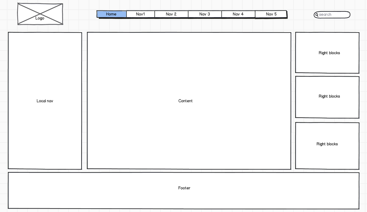
How a typical web site is structured.
So in the above example we would expect assistive technology such as a screen reader to read out the logo, then the main nav items, followed by the search, local nav and then onto the main site content. This all makes perfect sense, but sometimes developers will chop and change elements in the structure of the document, using CSS to absolute position elements wherever they want them to be. Visually the site will look the same, but as the structure doesn’t flow logically, users who are dependent upon keyboard navigation will be affected.
Consider that a HTML page at the highest level would be structured as such:
<html …>
<head>….
</head>
<body>….
</body>
</html>
In the body of the page we might have a series of div elements which section up the structure of the document, like below:
- top
- search
- localnav
- maincontent
- rightblocks
- footer
How it can go wrong
If the div “search” was moved to the bottom of the structure, but positioned using CSS to still appear at the top of the page, any assistive technology that then attempts to digest that page would have to navigate through the entire document to locate the search field. That user may be one hundred or so elements deep into the page before he finds what he is looking for. If you positioned your site search at the very bottom of your page visually people would find it completely unusable (if they ever found it), so why should keyboard accessibility be any different?
A solution to one problem, introduces another
Why would people do this in the first place?
Good question!
One reason is that some sites like to optimise themselves to meet Search Engine Optimisation (SEO) targets. If for example you stripped everything above the main content area out (logo, nav and search) and placed it at the bottom of the document structure, from an SEO point of view the crawler would go straight to keyword rich and highly weighted elements, such as your header 1 page title and page article content. The theory is that the first items a crawler see’s gain more SEO weighting, and the further into your document structure it goes, the less value keywords will have. So for SEO, you can see why some people would want to do this without necessarily thinking about the negative impact it may have on other user groups.
Another reason is actually a flawed accessibility improvement. Often without thinking it through properly, the top section of a page (logo, nav and search) will be stripped out and placed at the bottom of the document structure. The thought would be that this would save users of assistive technologies time by taking them straight to the content and by passing some countless number of links each time they access a page and want to view its main content. If this is done for every page it would save them a lot of time by going direct to that pages content. Obviously though this is a flawed concept, as users would then be left confused as to how they navigate the site, or execute site searches since they are no longer present where they would expect them to be, at the top of the documents structure. If both pieces of functionality are 100 key presses away, then you’ve probably lost them as a user and they’ll go elsewhere for their information.
There are two very powerful accessible solutions to take people directly to content without having to chop and change the location of code. HTML Skip links are one and ARIA navigation landmarks are another. I will discuss these techniques in more details in later articles.
So how do you test for this?
Probably the quickest way to test if your web pages document structure is correct, would be to open your browsers developer tool kit (usually F12) and inspect the mark-up manually – not everyone is comfortable in doing this though.
The easiest way to test the reading order of the document structure is to disable CSS on your browser. After doing this you will be able to see if the page follows the same flow as you’d expect, or if items like the main navigation have been relocated to elsewhere in the document structure.
Easier still the WAVE toolbar gives you the option to highlight where something is in the document structure at the click of a button, to identify any issues by intelligently placing a numbering system next to HTML elements which can be navigated by the user:
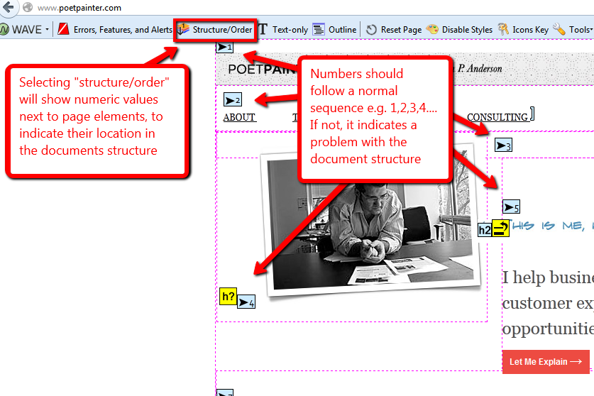
Using the WAVE toolbar to help identifying page components location in the document structure.
Conclusion
Playing around with your document structure can have dangerous negative side effects, which depending upon the extent of changes made, can dramatically reduce the accessibility of your website. Obviously this should be avoided at all costs.
Developing a document structure strategy for your web pages can proactively avoid such issues and from the consistency it brings throughout your pages/templates, it will help you easily introduce further accessibility improvements such as ARIA Landmarks and skip navigation links. It also helps speed up the initial production of markup and CSS, while also making them easier to maintain going forward.
Be nice with your HTML and thanks for reading.
Related posts:
Hi Darren,
After researching aids for developing and testing sites for accessibility I came across the Wave toolbar. I installed it locally and found it to be fairly impressive. Then I emailed it out to the entire development team!
Good post, as normal.
How are you anyway?
Cheers,
Andrew
Hi Andrew,
Great little tool! Quick and easy, but sometimes produces a lot of false positives, just like any testing tool which evaluates issues automatically for you. The fact that it visually highlights issue makes it very easy to use, but what I like about it most is that it interacts directly with the DOM, unlike some validators, making it a much more realistic test.
Read up on everything it highlights and you’ll expand your knowledge quickly. It’s great to see you’re getting the other developers interested in accessibility.
Everything is great here mate, looking forward to meeting up with you in a few weeks.
Thanks,
Darren.
What about the more semantic nature of some html5 elements? Do they mean that logical structure is any less important? I’m assuming most assistive technologies will enable the user to identify, say or elements from the markup, though I haven’t tested that assumption.
Sorry, your blog stripped out some of my post. I meant “will enable the user to identify, say nav or article elements from the markup,” (angle brackets removed).
This would make their position in the document less important if a screen reader user, for example, is able to call up an interface that allows them to go straight to an article or the nav element.
As I say, haven’t test it.
Hi David,
Yup, that is certainly the case, although I don’t think at the time of writing any support the article element (would need to check).
This negates the importance of getting your document structure correct, yes. However it goes back to basic usability principles in relation to design patterns. If someone expects a search field somewhere around the top of your website, then what would they think if they found it below your footer? Assistive tech is no different, even with application shortcuts, if they expect to find an item near the top of their shortcut popups list and instead find it at the bottom, then they might very well be left confused. Instead it makes sense to just do it right in the first place.
Assitive technology shortcuts are fantastic though. I’ll be talking about improvements you can make to your websites which enable users to make better use of these, when I find time to get back into writing this series of posts.
Thanks,
Darren.